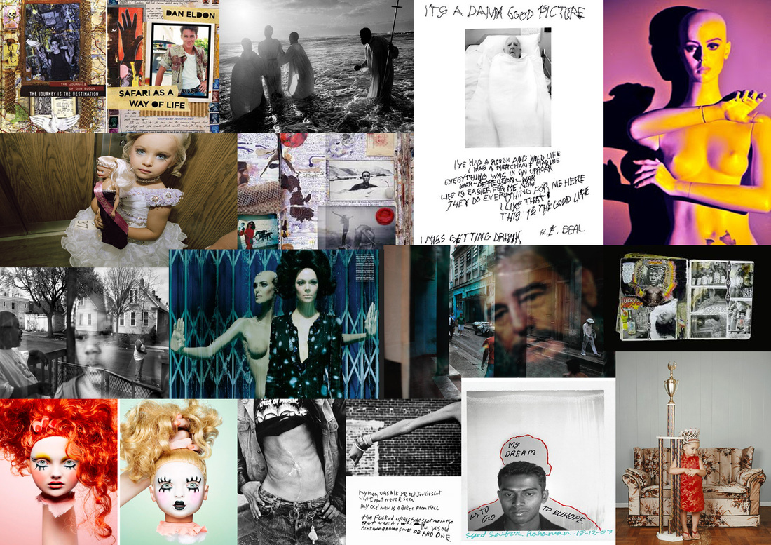
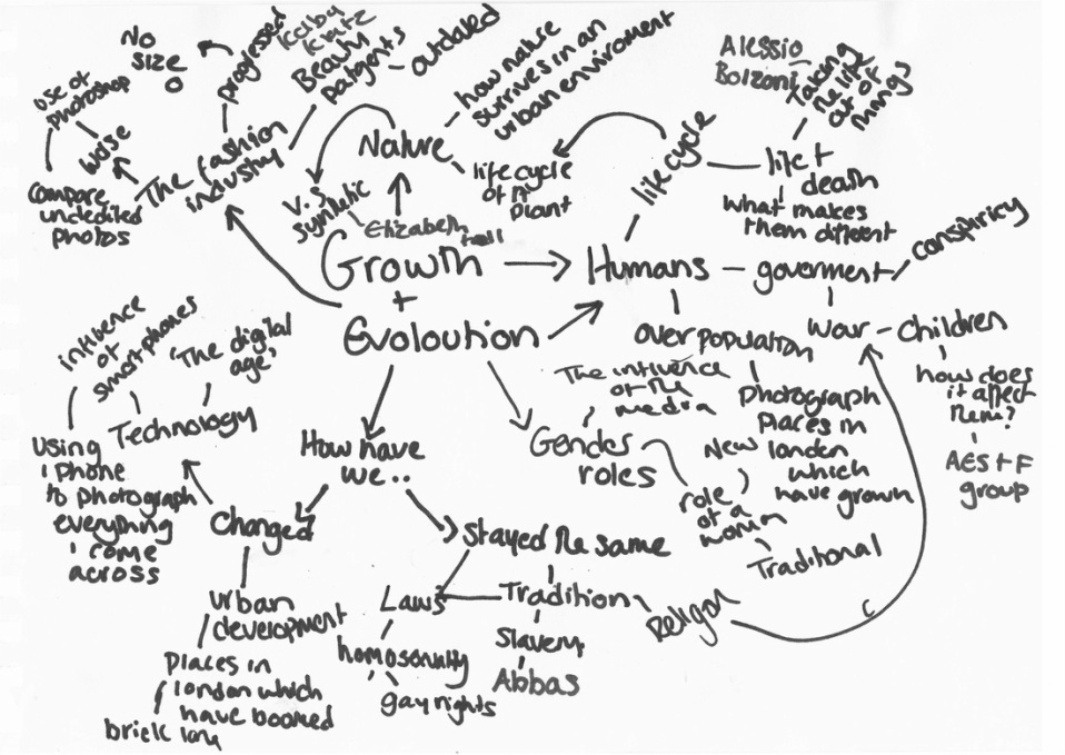
VISUAL & MIND MAP-
Set Task 1: Evolution of Time
Task
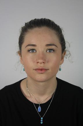
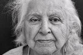
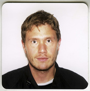
Take a portrait in the the studio and then find an image on the internet of an old face. Try to make sure the poses are similar.
Using the photoshop tutorial opposite merge the two pictures and create an aged portrait.
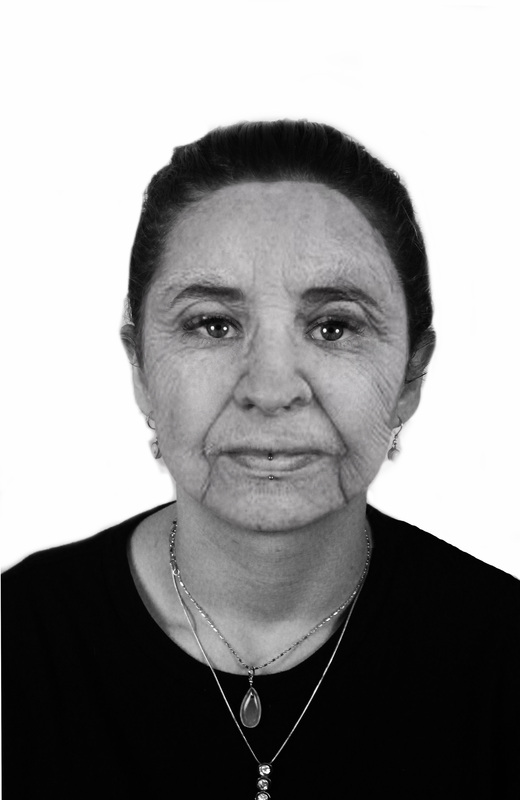
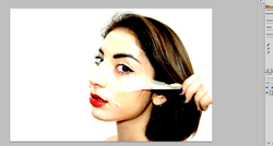
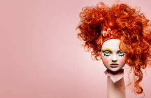
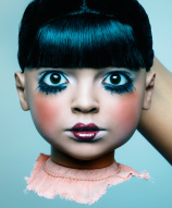
We were set the task to age ourselves using photoshop and following a youtube tutorial Using photoshop I merged The faces of myself and my classmates with photographs of old people from the internet.
|
|
|
|
|
|
|
|
|
|
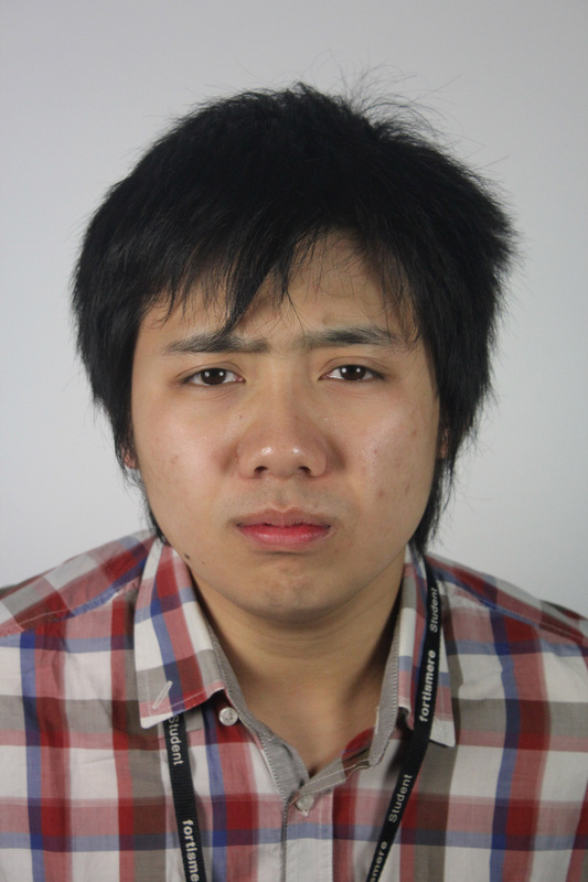
Step 1
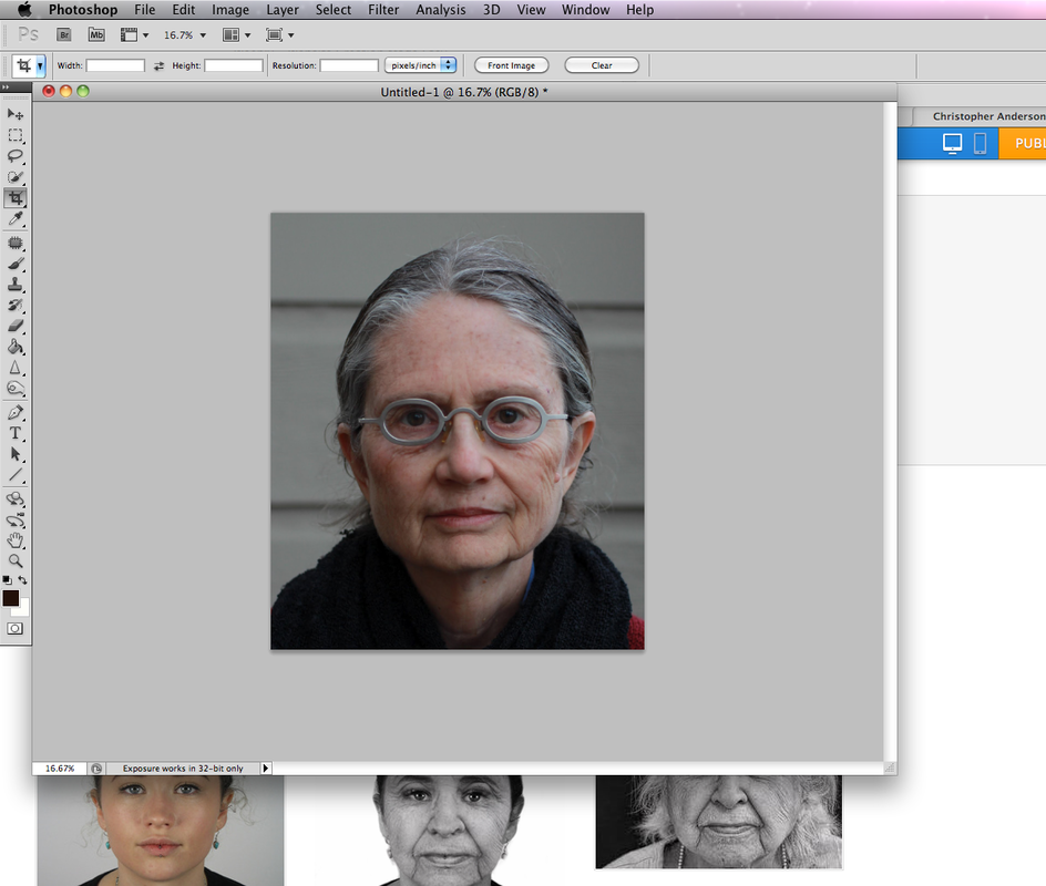
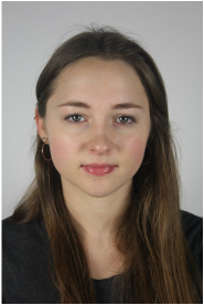
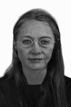
I started by taking a photograph of a girl in my class and finding a photograph of an elderly woman who is shot from the same angle.
|
Step 2
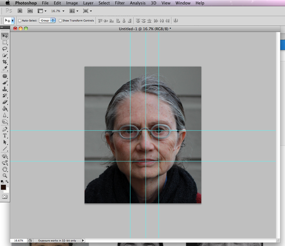
using photoshop I put 3 horizontal grids on either eyes and down the centre of the face. I then put 2 vertical on the eyes and mouth in order to aline both of the faces.
|
Step 3
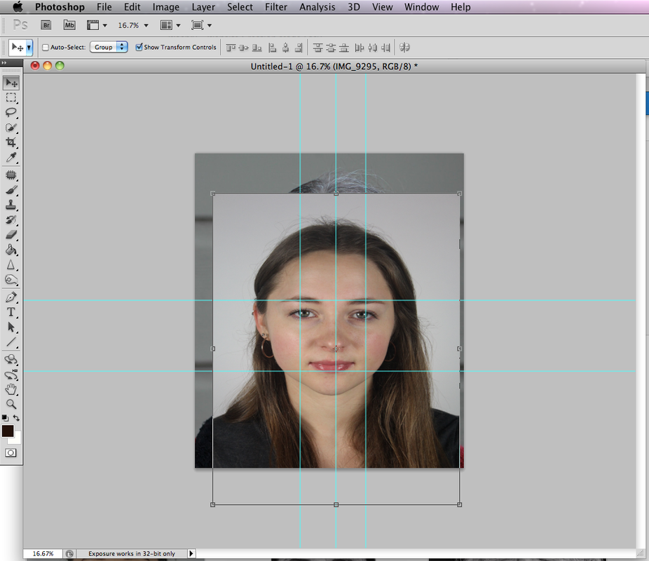
I then pasted the studio photograph and aligned it with the grid in oder to merge the two faces.
|
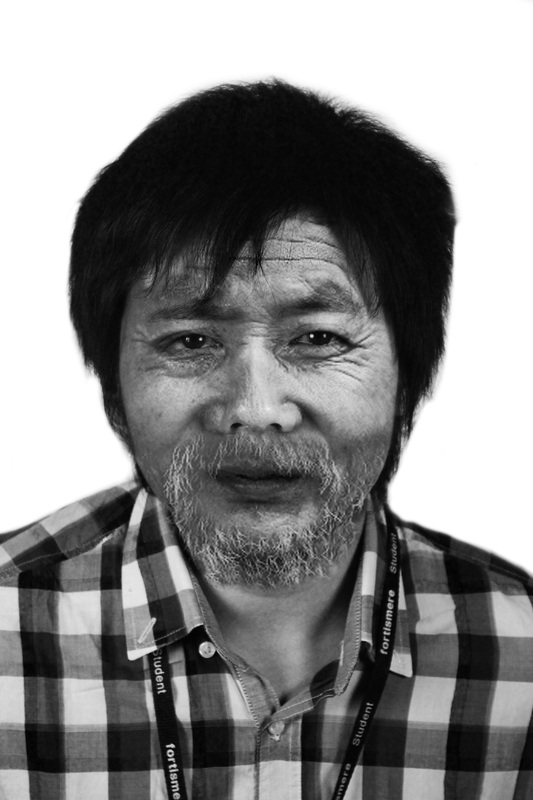
Step 4
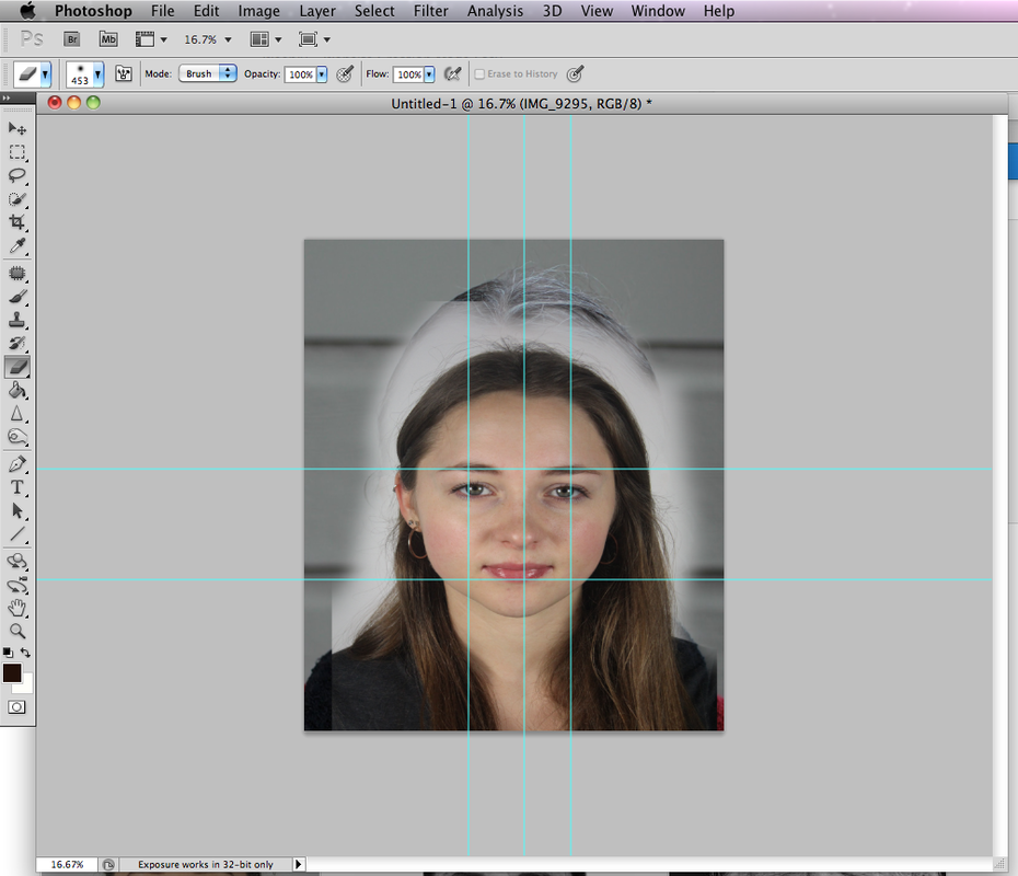
I then made the old woman the top layer and set the opacity to 43. Using the erase tool I took away the hair and obvious features of the old woman, making sure to keep the facial details such as wrinkles.
|
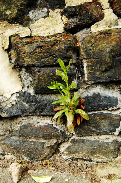
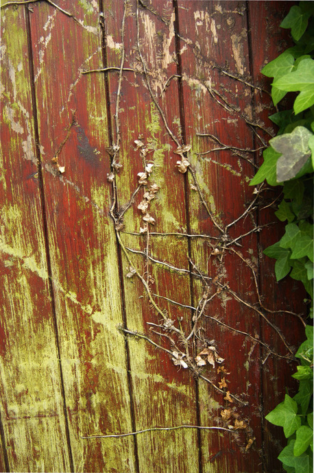
Set task 2: growth of nature in a man made environment
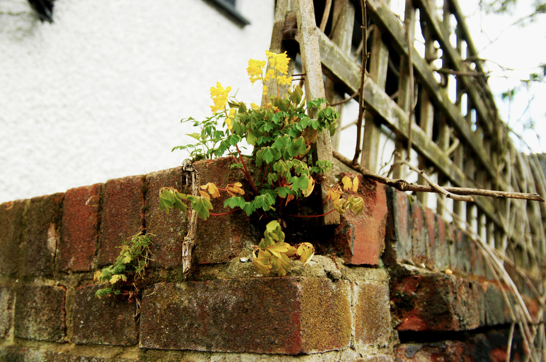
|
|
Set task 3: Didas house
I took this set of photographs at my grandma's house in highgate, I decided to use her because I think her house says a lot about her personality. originally from South Africa her house has a lot of african themed decoration. I Wanted to get across the warmth of her home. I wanted to take close up potraits of her using the same documentray style as jim Goldberg who tends to use close up to fuly enage with his subject, getting there story across to the viewer. In photoshop I increased the
Starting points:
1. Natural vs synthetic
- synthetic takeover of nature
- Real vs fake |
2. Documentary photography

using photography to document events/ people in a natural way
|
3. Fashion narrative
Creating a clear story through fashion photography.
|
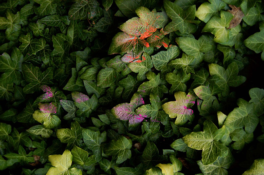
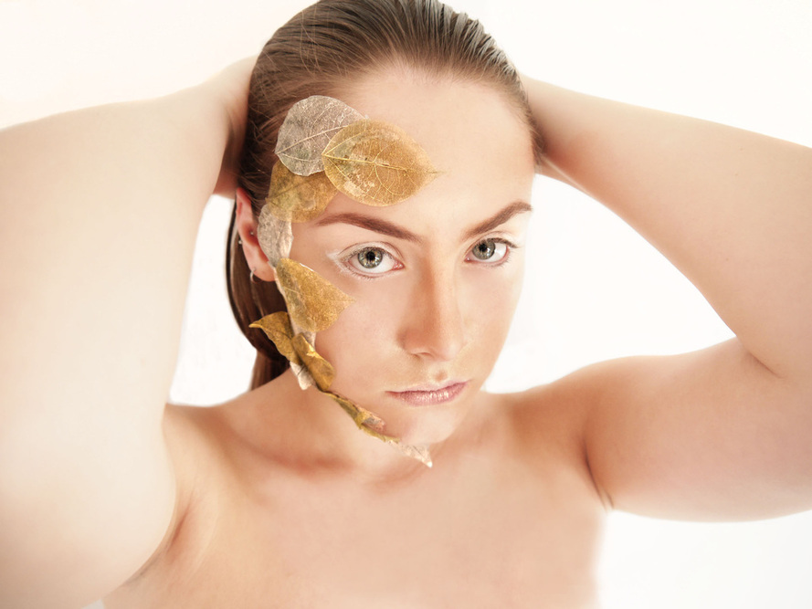
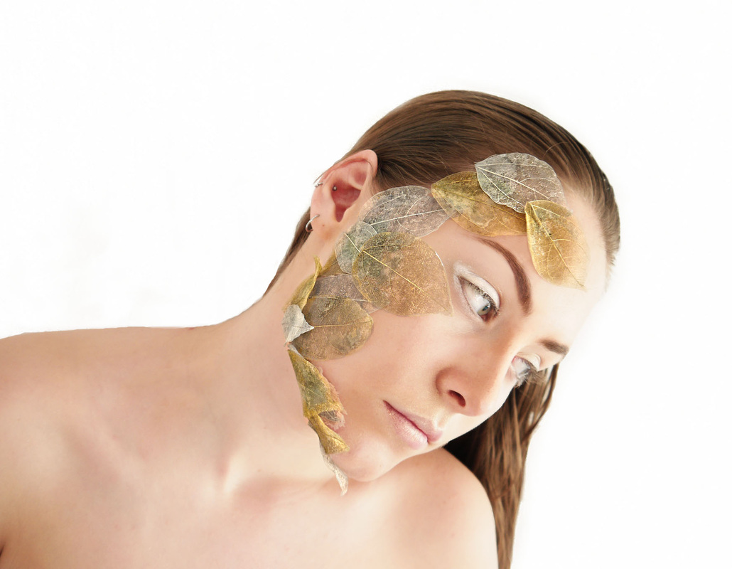
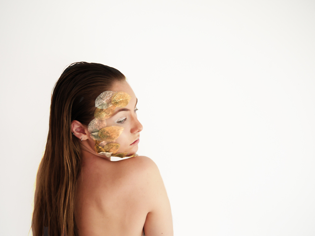
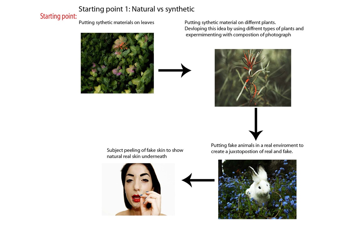
Starting point 1: Natural vs synthetic
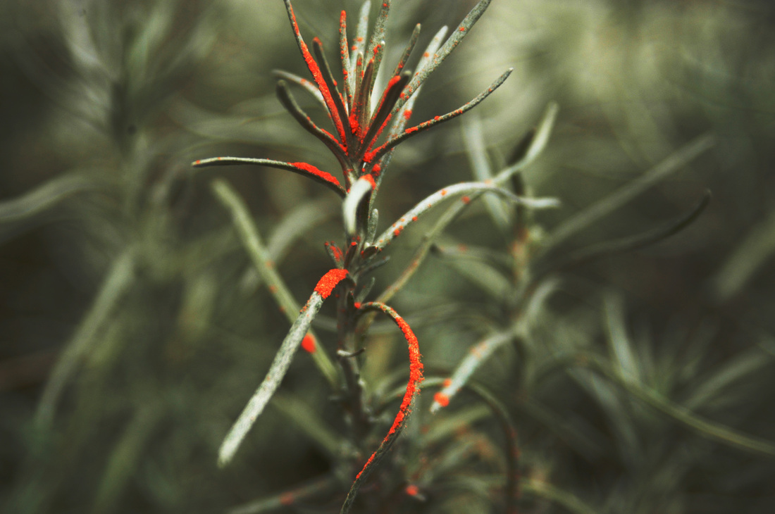
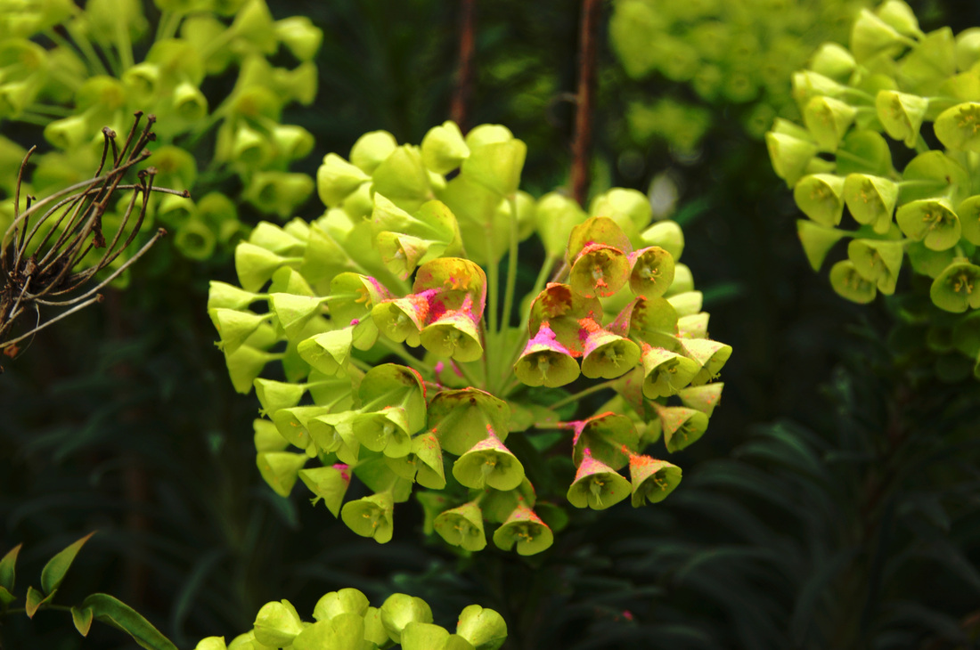
To begin my first starting point I wanted to experiment with adding synthetic materials to natural plants. I began buy using colourful eyeshadows as i like the powdery texture. I also thought this texture would contrast well with the smoothness of these leaves. I then used photoshop to sharpen parts of the photograph in order to further highlight this contrast. I think this sets of photographs worked really well especially the close ups. I wanted to try taking more close up photographs and I don't think the detail of this difference in textures was shone through this set.
|
|
Starting point 2:
Social documentary
|
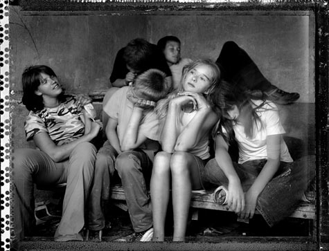
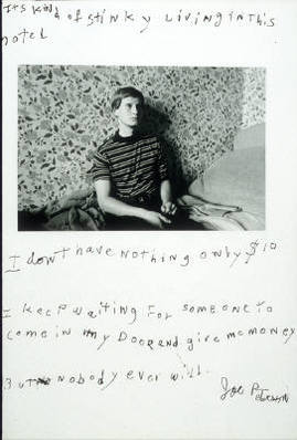
Jim Goldberg'My only agenda, is to bring attention to otherwise ignored and shunned lives.' - Jim Goldberg Born in 1953, Jim Goldberg is an American photographer who's work focuses on in depth analysis and collaboration with minorities who are forgotten in mainstream culture. His work includes a variety of mixed media, from polaroid to videos. Goldberg also includes text from his subjects which helps add to the intimacy of his work. One of his best pieces of work 'raised by wolves' is a mixed media piece that follows teenagers in the 90s who are living on the streets in California. This piece is particularly moving as the use of audio interviews paired with the photographs and the text written by the teenagers gives the audience a rare insight into the lives of these kids. It also raises the issues of homelessness. The way he shoots his subjects is up close and personal which give his images a snapshot type feel. Another of his works 'open see' follows migrants fleeing to europe and the photographs and scrawled smudged comments reveal the aspirations and fears of people who might otherwise remain faceless statistics. |
|
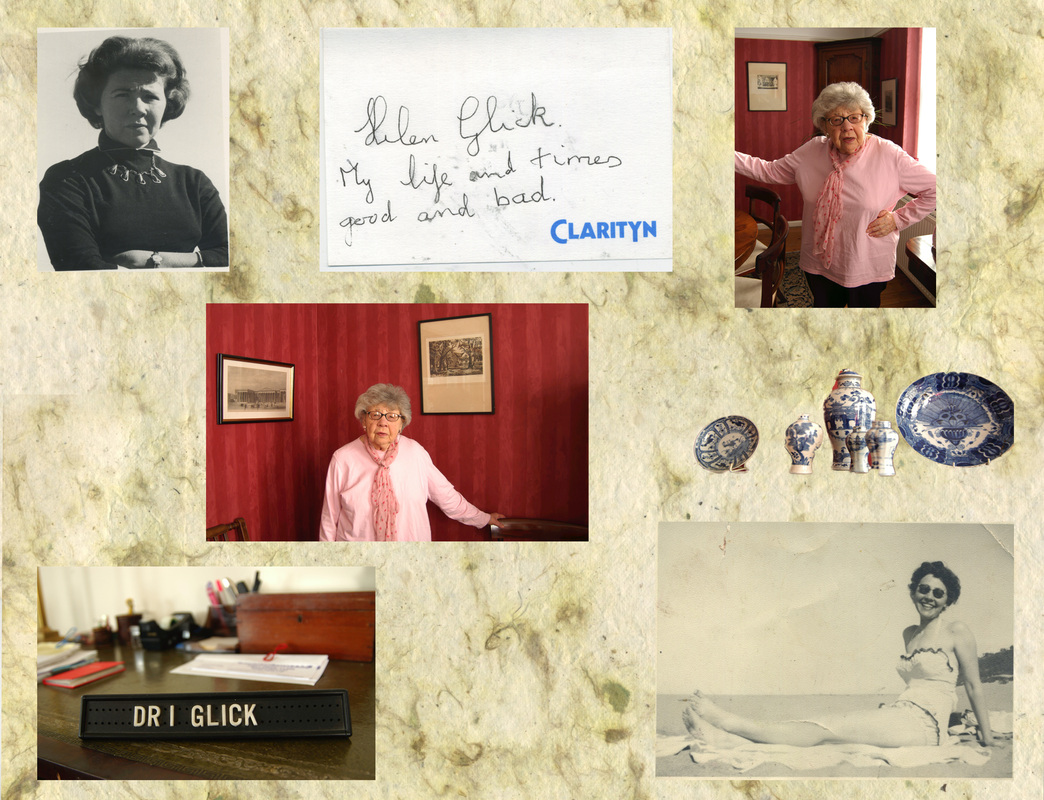
Starting point 2: Social documentary
For my first starting point I wanted to attempt to document the life of someone I have close relations with and who I know well; my grandma. Using a mixture of old photographs, and new ones I had taken of her and her house I wanted to create a collage that gives the viewer an idea of her personality and my relationship with her.
I started off using paper from one of her wedding albums as the base of the collage as I liked the texture and green colours. I used a range of photographs ranging from when she was in her 20s to recent ones i had taken. I also photographed parts of her home. At first I played around with layering the images on top of each other but decided that I liked it better when the different images where separate with space between them as it makes the image as a whole more clear.
I started off using paper from one of her wedding albums as the base of the collage as I liked the texture and green colours. I used a range of photographs ranging from when she was in her 20s to recent ones i had taken. I also photographed parts of her home. At first I played around with layering the images on top of each other but decided that I liked it better when the different images where separate with space between them as it makes the image as a whole more clear.
Helen
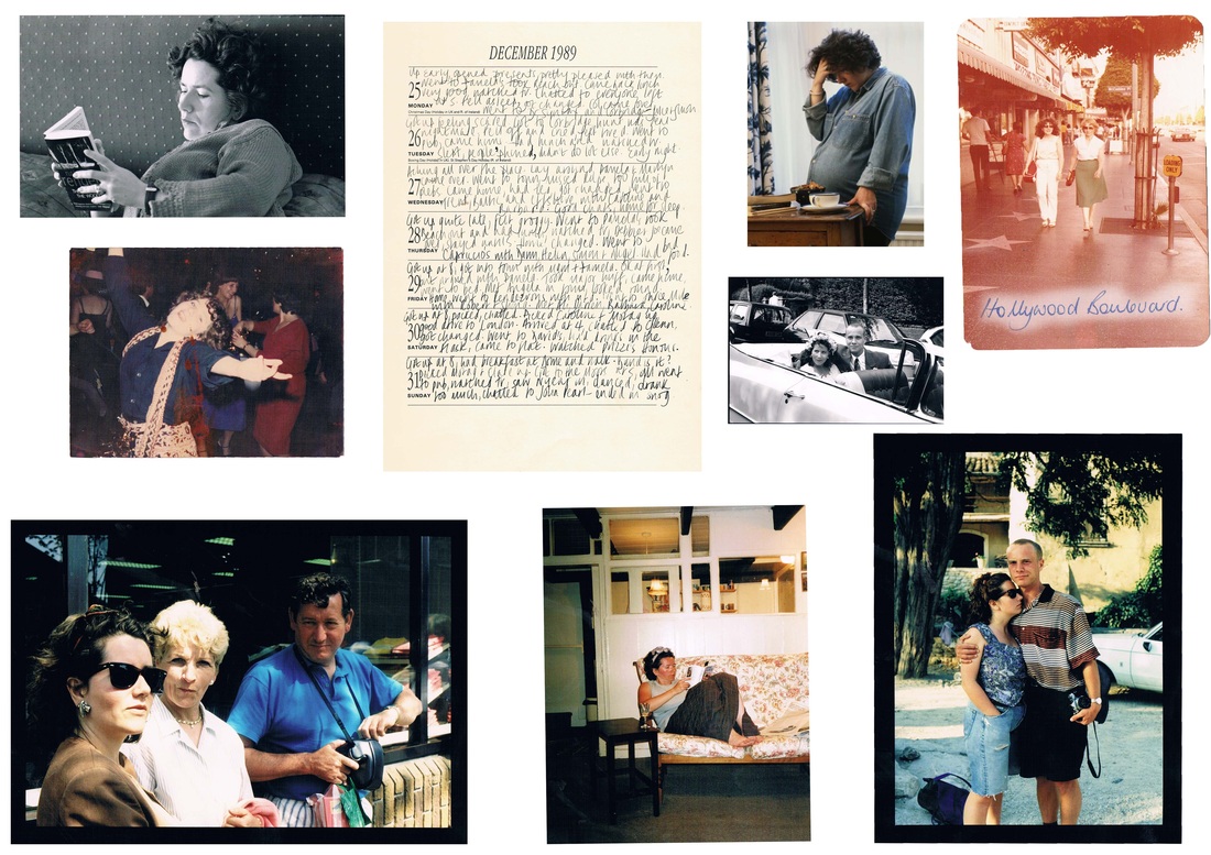
Wendy
Oliver
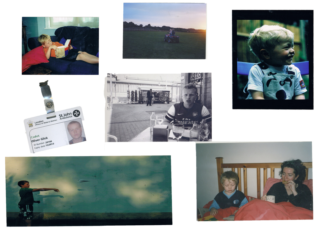
Development
as a development I wanted to make a compilation of photographs taken since I was born up until now, put them all together to display a progression of time and for the viewer to watch me grow through the years.
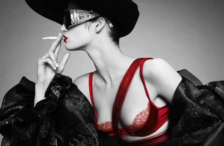
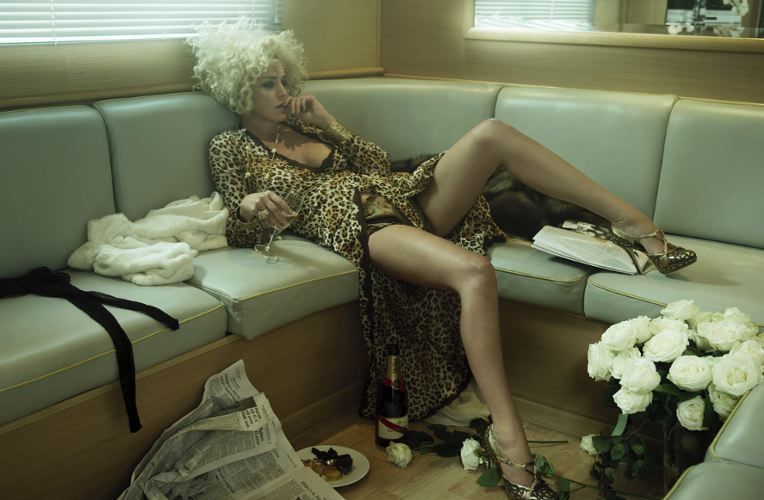
Starting point 2: fashion narrative
|
Jean baptiste Mondinoborn in 1949, Jean baptiste Mondino is a french fashion photographer and video director. He has directed music videos for the likes of David Bowie and Madonna. He then moved on to fashion photography, creating highly stylised photographs with themes of fantasy and strong narratives which is why I have included him. His photography style is known as 'Mondino-esque', named after him and characterised as chic, stylish and irreverent.
|
|
Strand 2- Fashion narrative: 'The Runaway bride'
To begin my fashion narrative strand I wanted to tell a story through a short concession of photographs. this was the story of a bride who leaves her husband at the alter, she then flees the scene and makes the painful phone call to end it all. I wanted to have a dramatic plot that could easily be conveyed. In the editing process I decided to make this set of images achromatic as I felt that it would help them gel together as a narrative and still look high fashion. I was also inspired by The work of John Baptisese Mondino who used black and white photography a lot to add the the drama of a photograph and allow for other parts of the photograph to stand out.
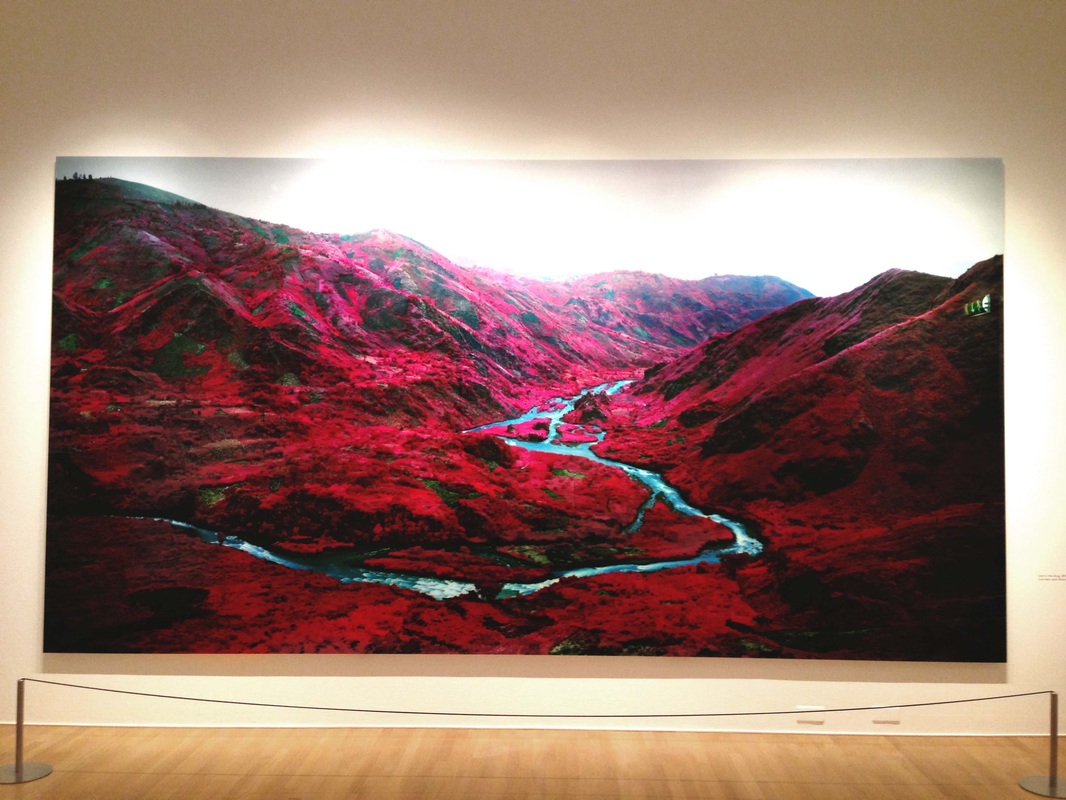
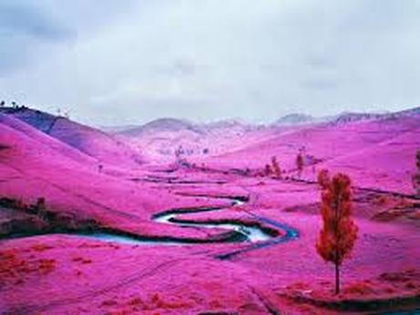
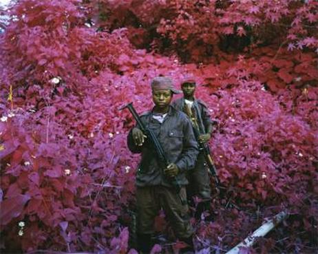
FOAM GALLERY- Amsterdam
-Richard Mosse exhibition
|
Whilst In Amsterdam I visited the Foam photographers gallery and came across an exhibition by Richard Mosee, a photographic journalist. He and a few others had travelled to congo to document the war, lives of the civilians whilst also capturing the amazing landscape. he used an inferred lens which was developed by the army to detect enemies and therefore turns all greenery into red/pink tones. I thought this exhibition was amazing and the installation of different projections with surround sound (as shown in the video bellow) was so impactive.
"Both mesmerising and sickening, a 40-minute film and a series of photographs portray the Democratic Republic of Congo in a disturbingly clever way. The film, shown in a disorientating dance across eight, huge screens, is unquestionably a tour de force of immersive filmmaking, but Mosse’s genius lies in his use of Aerochrome film to document his time spent embedded in both rebel and paramilitary Congolese forces. Invented by the US military to pick out infrared light normally invisible to the naked eye, the film turns green tones to red, saturating the footage with a pink that becomes nauseating as the sinister story unfolds. It is an apt transformation for a country indelibly stained by decades of bloodshed. Vivid dreams sometimes have an uncomfortable reality that seeps into the experience of the day. This unnerving quality pervades The Enclave; Mosse notes that ‘the real is only effectively communicated through shocks to the imagination, precipitated by the Sublime’. It is a sad irony that in jolting this remarkable first-hand footage into the realm of the surreal, the artist makes us acutely aware that for the troubled DRC, this is a nightmare that will not disappear in the light of day." 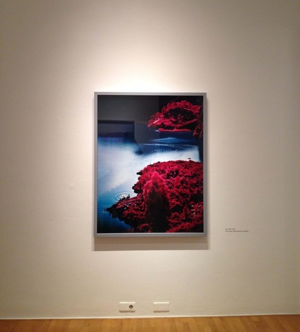
|
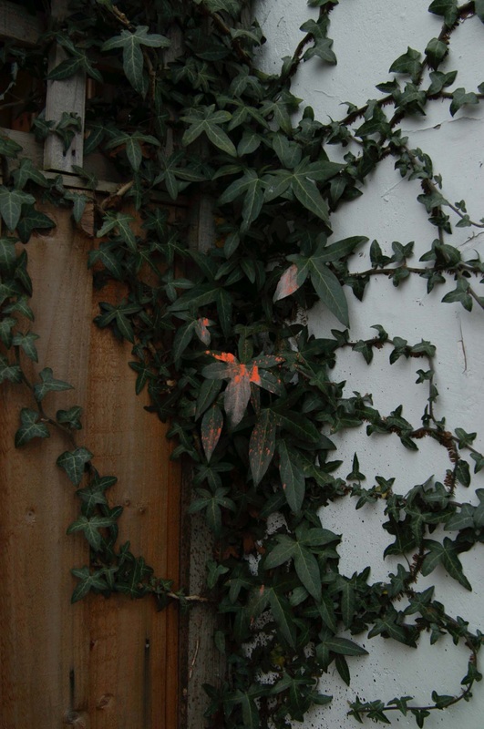
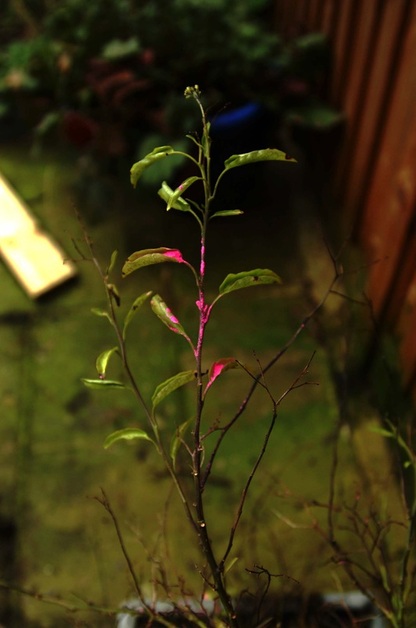
Natural vs Synthetic continued
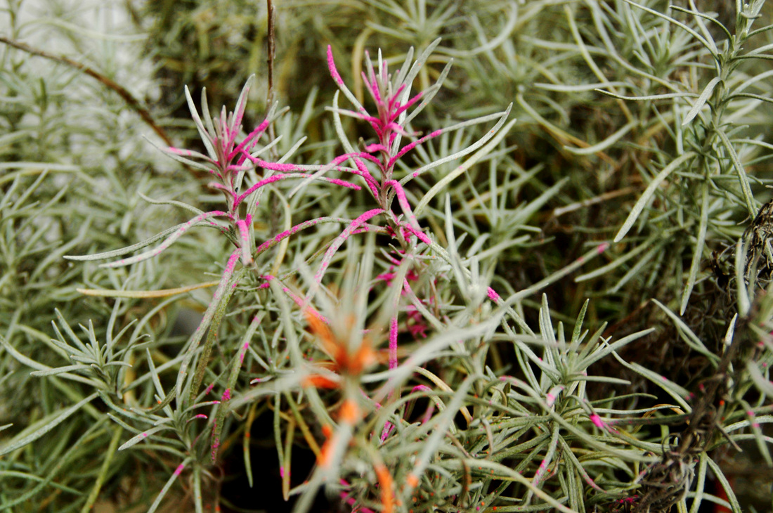
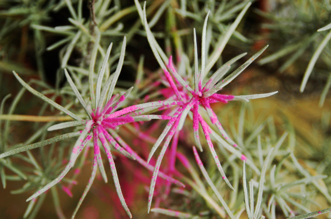
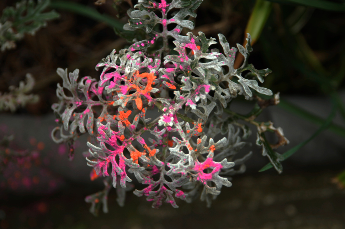
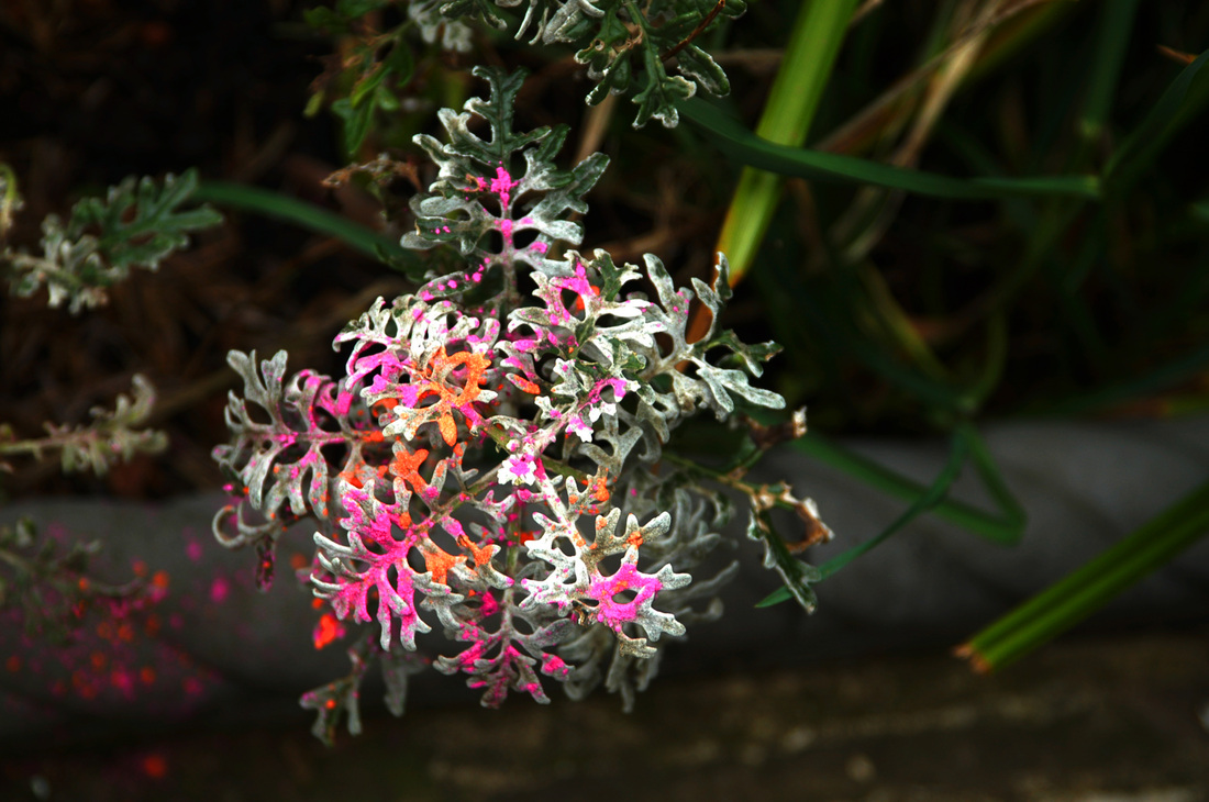
I wanted to develop the first set of photographs I took of the brightly coloured powders on the different plants. Experimenting with the different types of plants and composition of the photo. I found the best photographs were close ups, with the plant in complete focus so that you are able to clearly see the juxtaposition of textures between the powder and plant. I also liked how the rest of the plant being out of focus, created an interesting pattern behind. I also wanted to create more colourful photos with the earthy greens and browns contrasting well with the neon orange pink. I think this set of photographs worked better than the ones before. With the attention to close up details and the background blurred out working the best.
This was one of my favrioute photographs from this set, the main focus of the plan running vertically through the centre of the photo
|
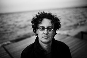
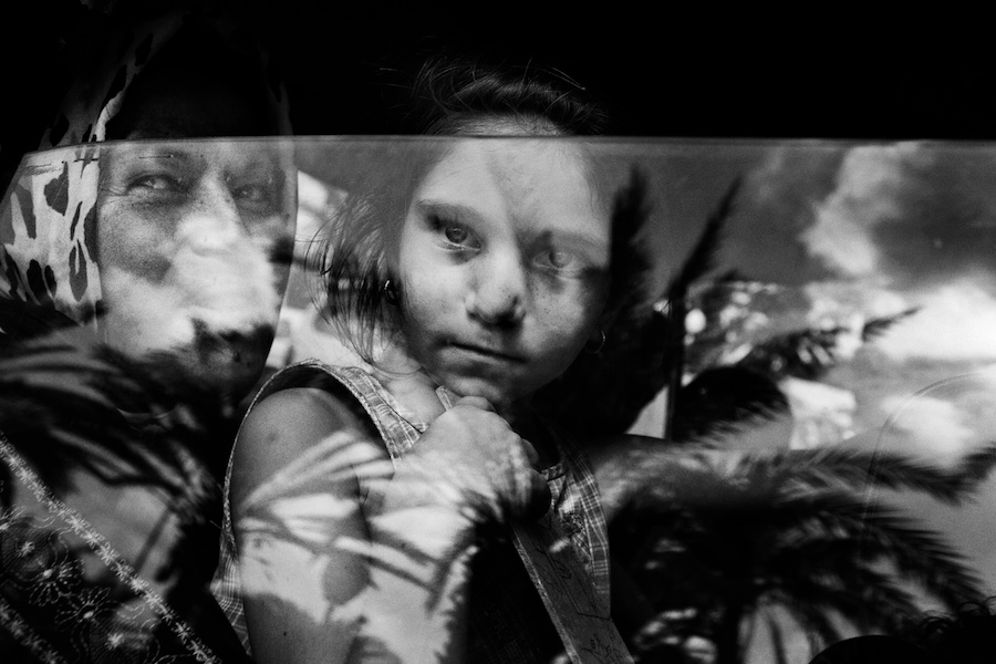
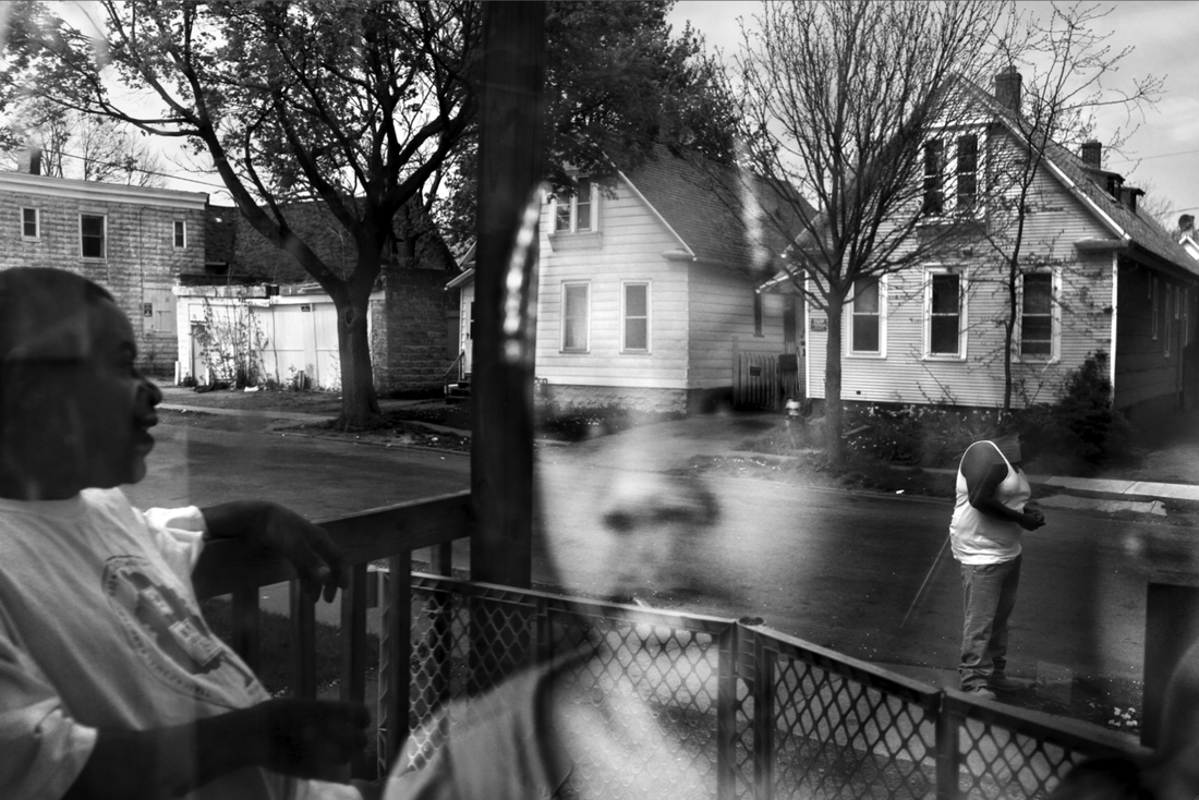
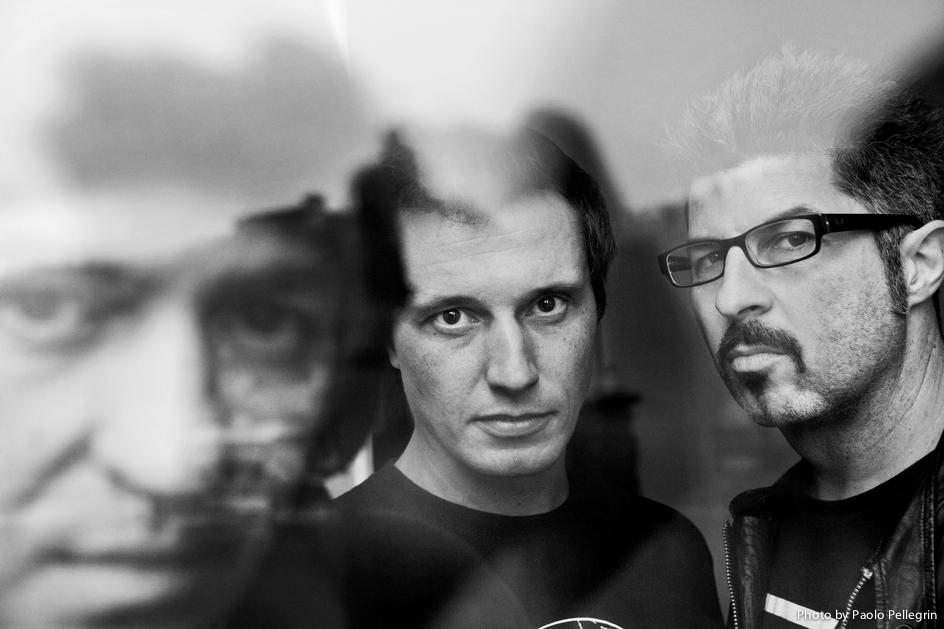
Paolo PellegrinBorn in march, 1964 Paolo Pellegrin is a Photojournalist. His career began in 1987 after he graduated from college and began working in italy, photographing immigrants, the circus and homelessness. He has since gone on to exhibit his work all over the world and raise awareness for a number of different social and economic issues. His work is typically black and white and feature close up shots giving the viewer a full insight into the facial expressions and emotions of the subjects. I espcially like the technique he uses in some of his photographs of layering another photo, typically a scene or place with a lower opacity.
|
|
Subjects and their environments
Inspired by some of the techniques used by Paolo Pellegrin I wanted to experiment with layering images to create a more complex photograph, I also thought it would fit in well with this strand of photo documentation. I took some photographs I had taken on holiday and merged subjects with their environments. Playing around with the opacity of the photographs. If I were to continue this strand I would want to include subjects and environments that have meaning to each other. in order to create a deeper story for the viewer.
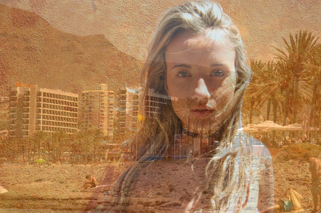
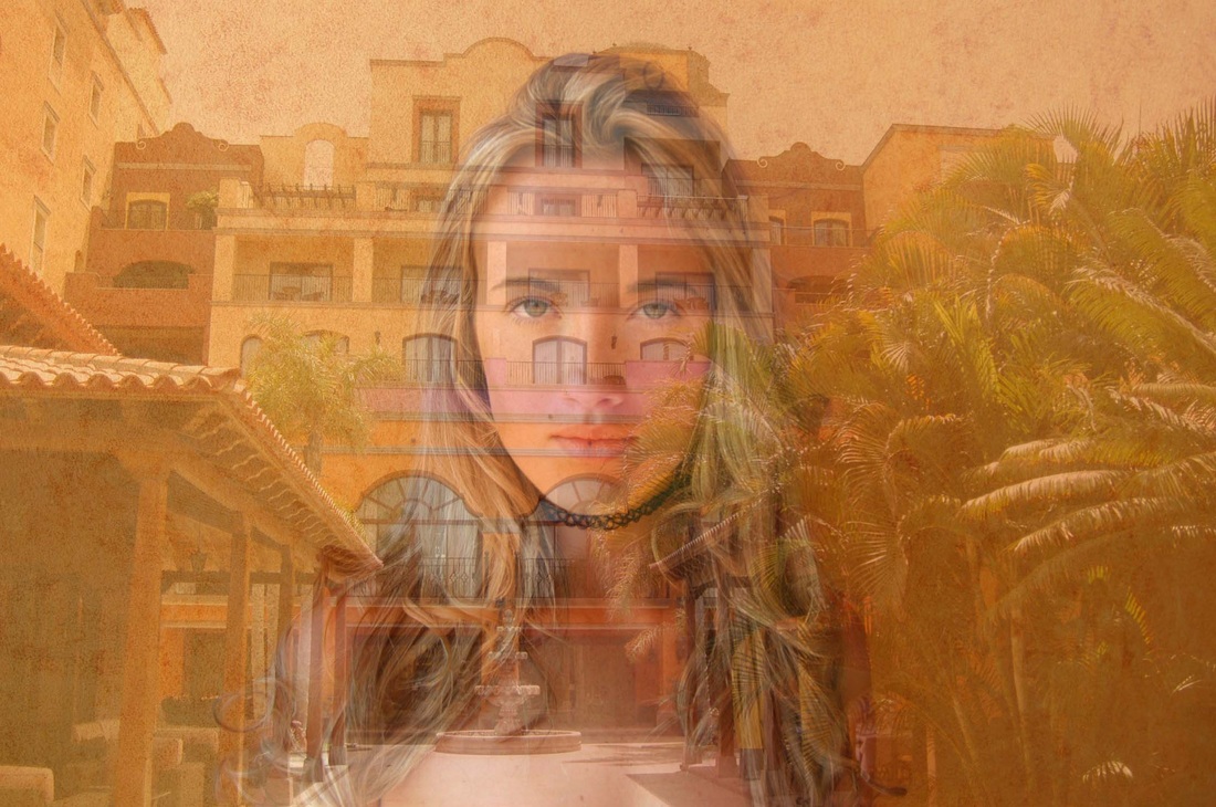
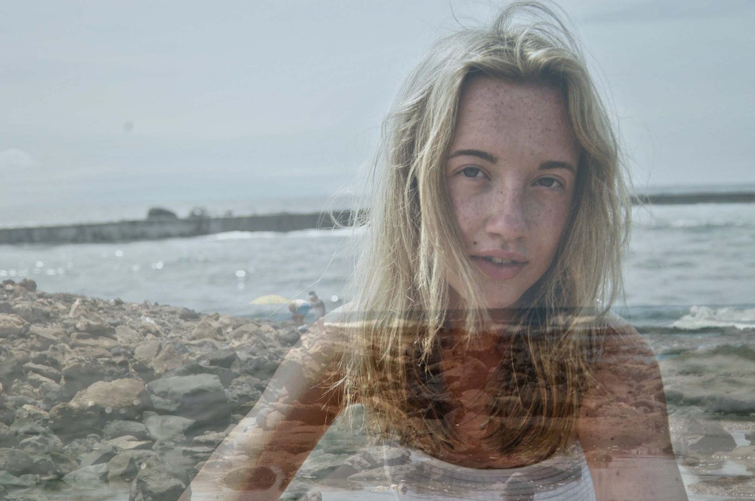
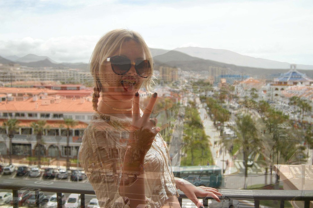
How I did this..
|
Firstly I selected, copied and pasted the environment image into the portrait of my subject.
|
I then reduced the opacity and fill of the top layer, playing around with diffrent percentages of opacity to see what looked best. I also played around with which layer went on top
|
Finally I used the erase tool, with an opacity of around 20 to go over the subject and erase some of the background as to make the subject stand out a bit more.
|
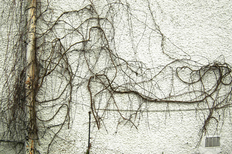
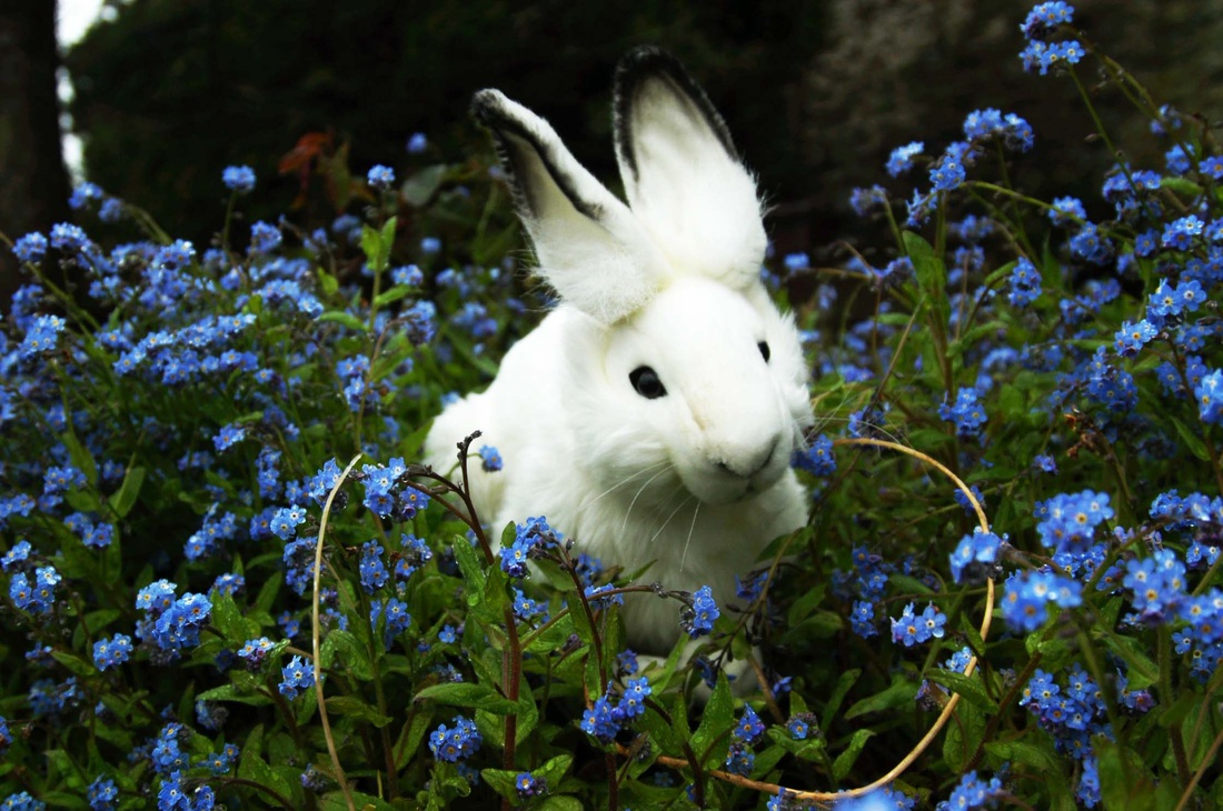
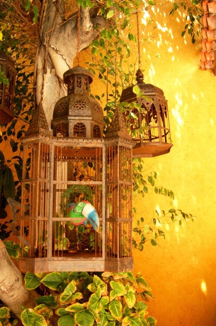
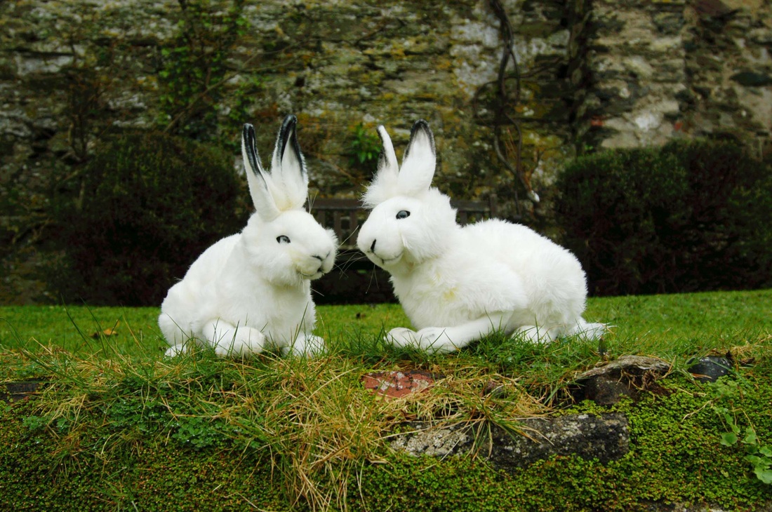
Natural vs synthetic continued
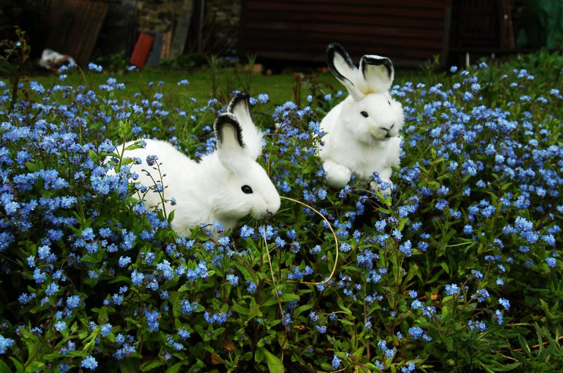
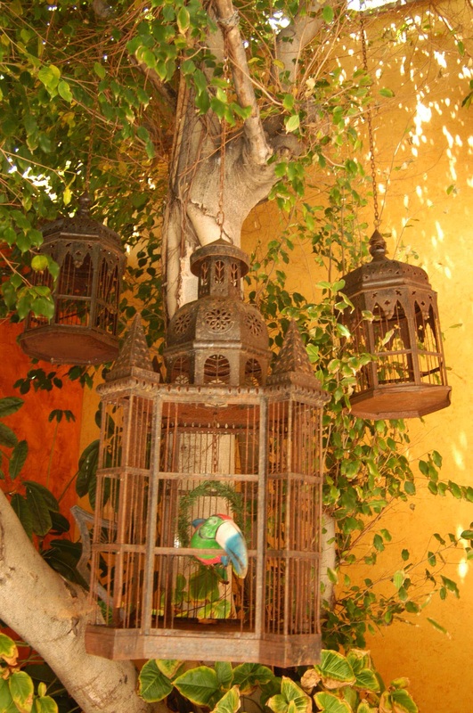
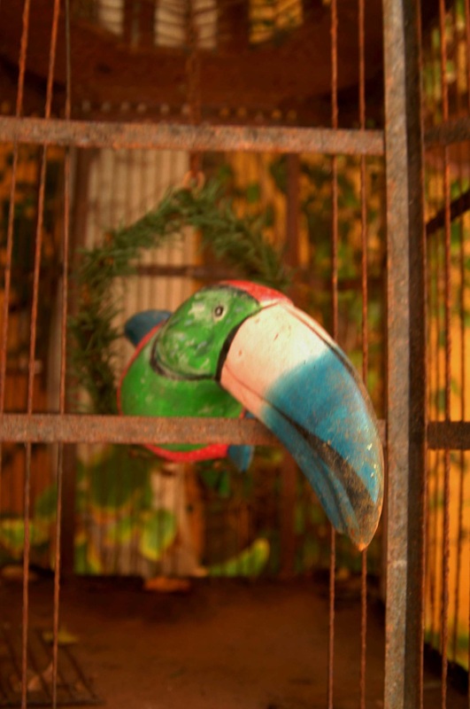
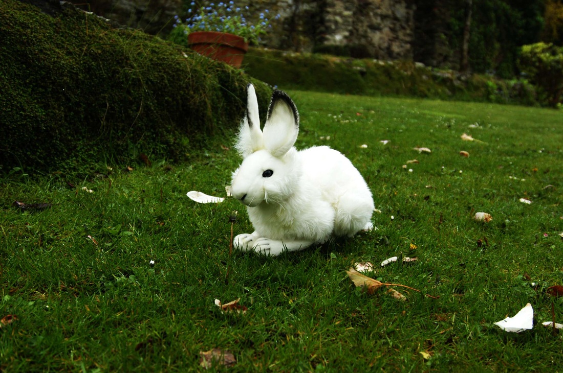
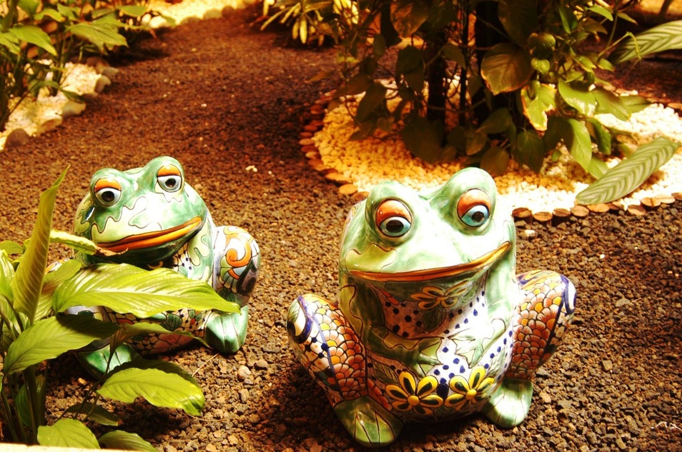
This set of photographs I took are of fake animals in real environments such as grass or birdcages. I wanted go photograph these fake animals in a way that would make them, at first glance look realistic.
|
|
|

|
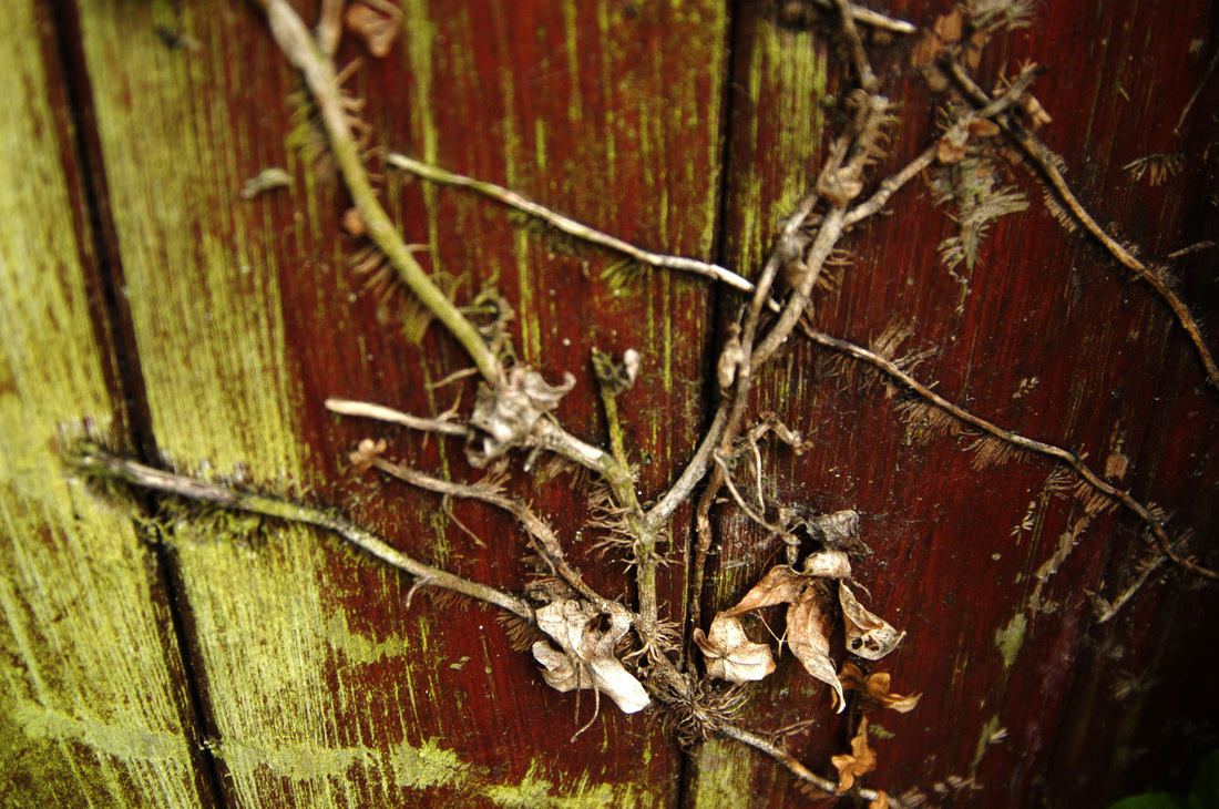
Nature fighting back
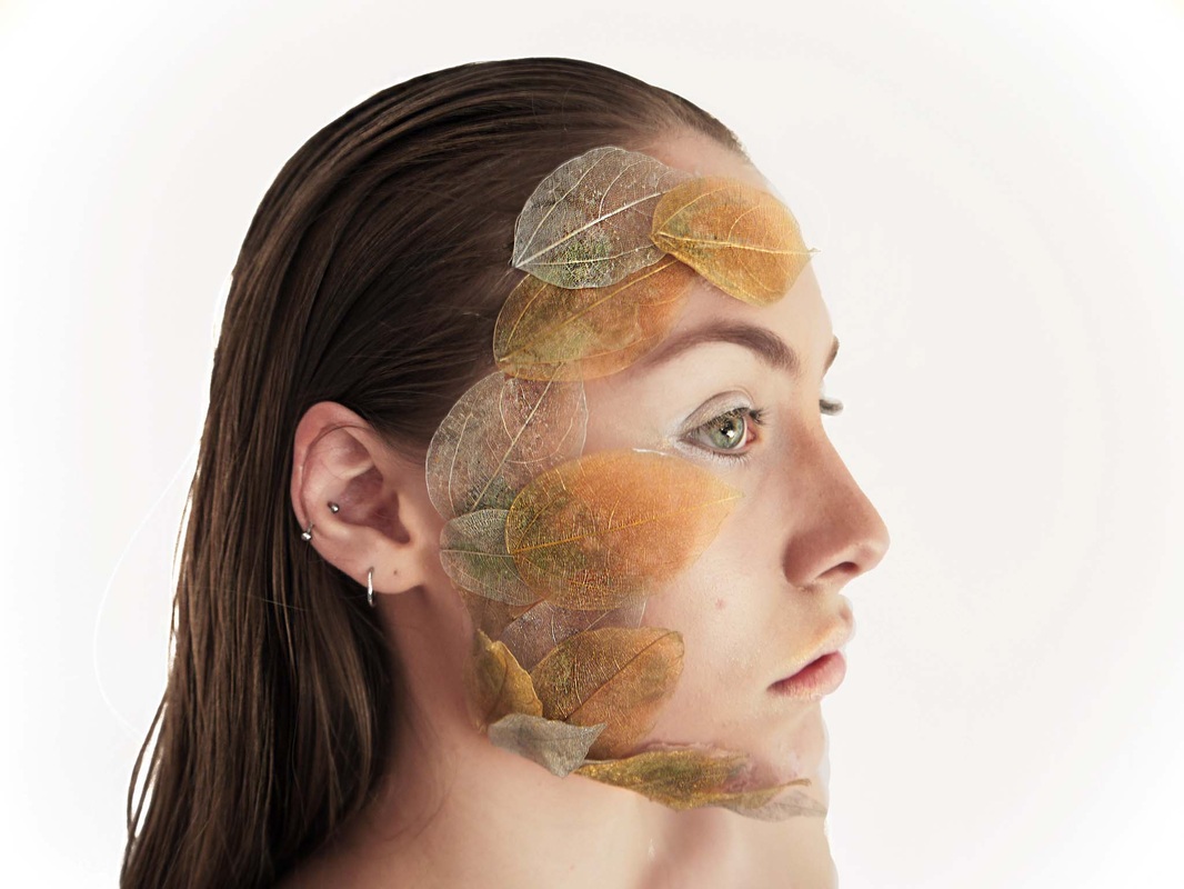
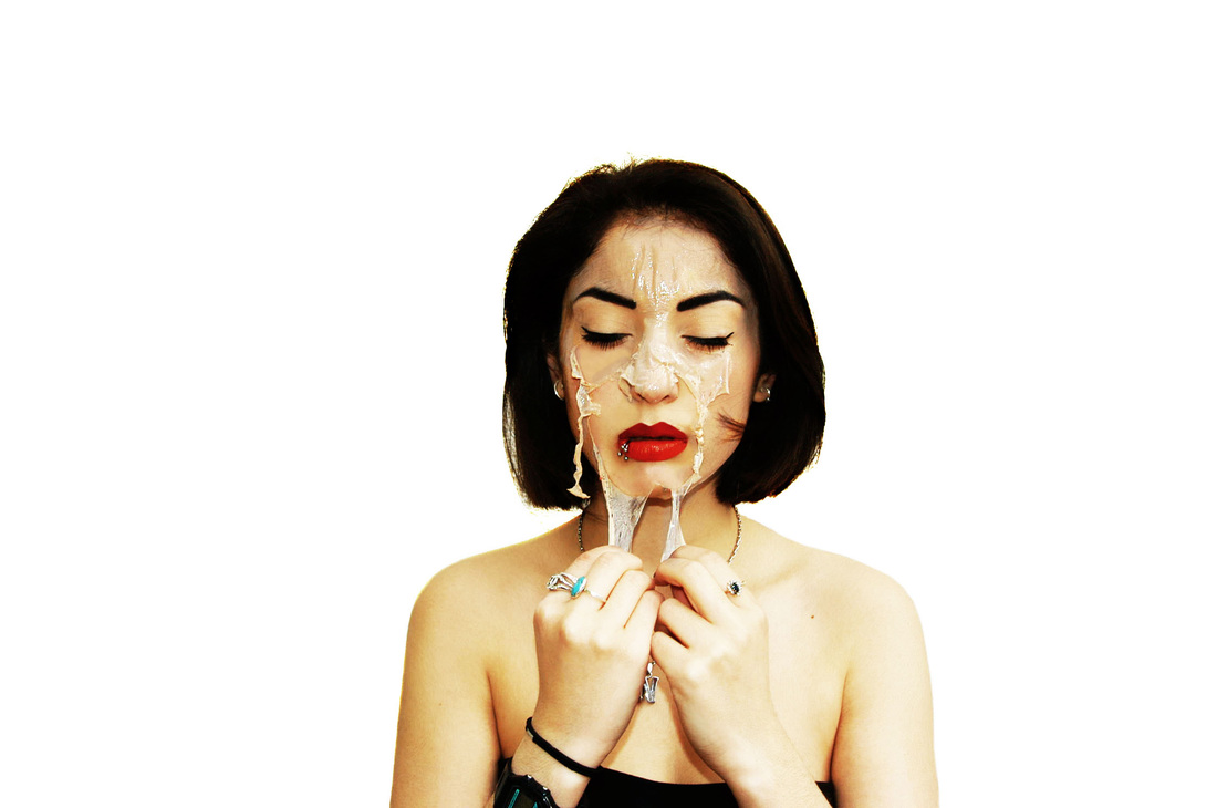
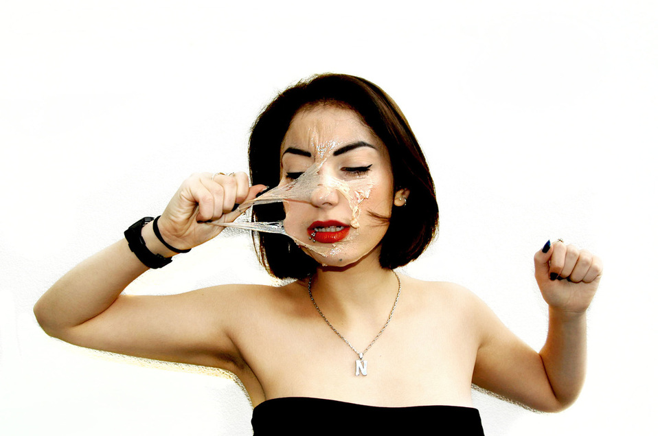
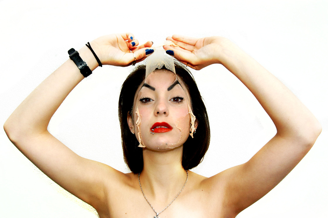
Natural vs synthetic: Peeling off the fake
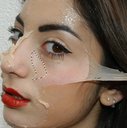
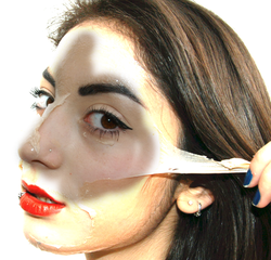
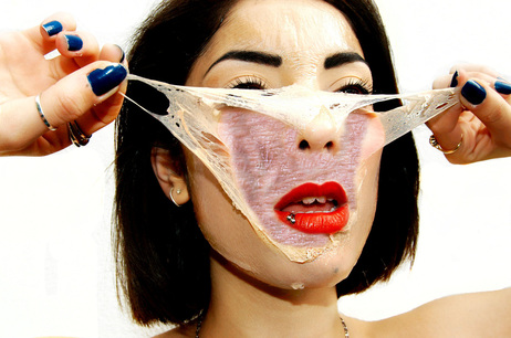
For this set of photographs I wanted to develop my idea of natural vs fake and I was inspired by the idea of taking off the synthetic to revel the natural underneath. I used a face mask and shot these photographs outside against a white wall, this did cause some problems as I had to spend a lot of time colour correcting the background making it white and even, as the wall was textured and distracting from the subject. If i were to shoot this again I would do it in a studio with controlled lighting, I would also have put the mask over the subjects lips as well as I think it would have looked better to have her peeling off the lipstick as well. I then used photoshop to clean up the image and sharpen the parts of the face which has the mask on in order to see it more clearly and a surface blur to make the skin underneath soft, creating a clear contrast and enhancing the effect of skin being pulled of her face. I also tried to lay the photographs out in chronological order starting with pulling of small parts to the end in which she has almost pulled of all of the mask.
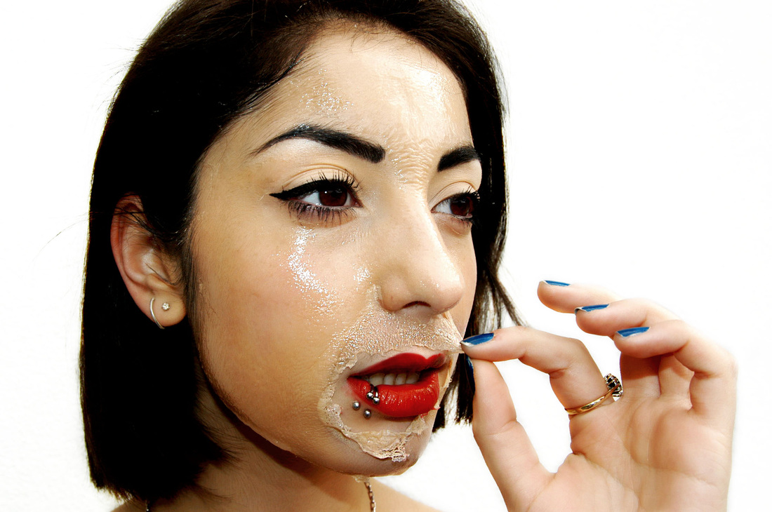
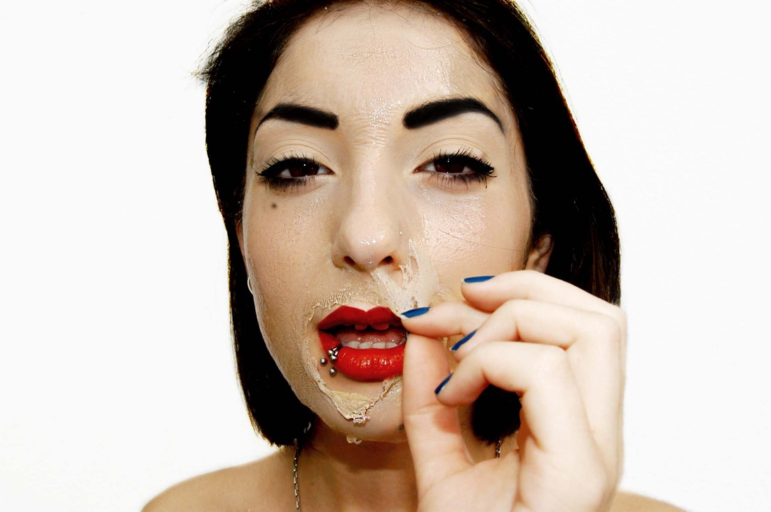
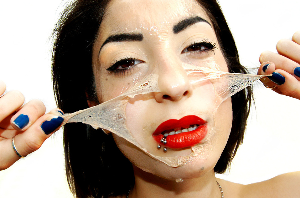

This photograph was one of my favrioutes as I think the 'skin' looks really realistic The close up side view means you can see clearly the models face and I like the hand that is pulling of her skin. Her direct eye contact is striking and the difference between the rouge corse skin being peeled off and soft, slightly red and natural skin underneath is really clear in this photograph.
How I did this...
Before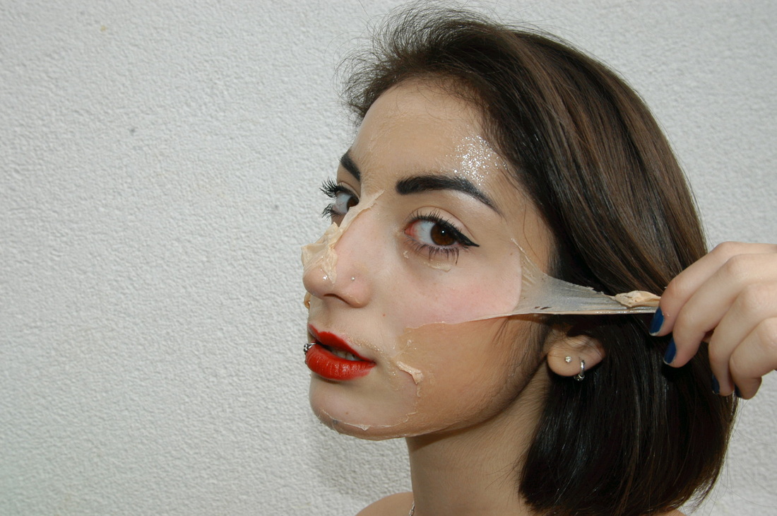
|
After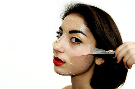
|
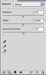
Due to the uneven lighting and the backdrop being uneven I edited each photograph treating the model and the background as two separate images
|
First I changed the exposure of the background, adjusting the offset and gamma correction and just focusing on the backround.
|
I then used the dodge tool to completely lighten any sections of the background that were darker due to shadow. And in section where the background had turned yellow I used the clone tool to make the background a block colour of white.
|
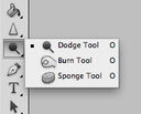
I then opened the image in a separate window and began touching up the models face using the dodge and burn tools, clone tool and patch tool.
|
|
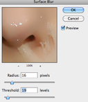
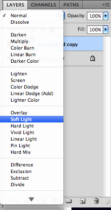
Next I wanted to Make the difference between the 'fake' skin and the models real skin underneath very prominant. First I worked on the skin underneath. Duplicating the layer and adding a surface blur to the the top layer. changing the radius to 16 and threshold to 19. I then changed the blending mode to soft light to create soft, smooth yet realistic skin. As I wanted the skin to look realistic I didn't colour correct it, leaving it with a slight pink colouring. I then erased the top layer from parts of the face with the mask on it in oder to keep its rough texture.
|
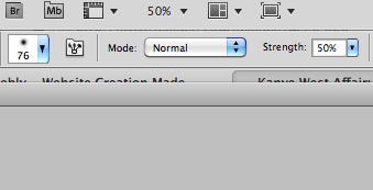
I wanted to make the 'fake skin' more coarse, especially the parts that were peeling off the face. To do this I Used the sharpen tool, on a strength of 50% going over the parts of the face that I wanted to stand out more.
|
Finally I pasted the background layer (high exposure) on the touch up layer and using the eraser tool (at the vary of different size and hardness) rubbed away the face of the top layer. this created my final images which I was very happy with.
|
Development
To develop this idea I wanted to add wrinkled skin to the natural skin to create a surreal effect of old skin underneath. I experimented with the photographs I had already taken. Using Photoshop and the clone tool I transferred wrinkly skin taken from google onto the models skin. I then went and took more pictures with the intention of doing this effect again.
|

|
|
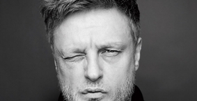
John RankinBorn in 1966 John Rankin in a scottish fashion photographer, who was was brought up in England. He studied at London college of communication. along with Jefferson Hack he created a magazine called dazed and confused which quickly gained a cult following. He has since had a long career in fashion photography.
|
|
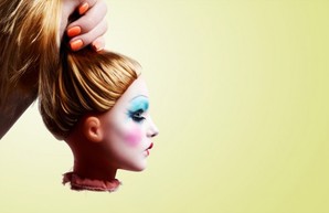
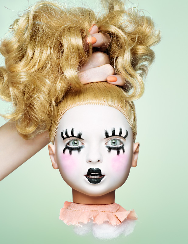
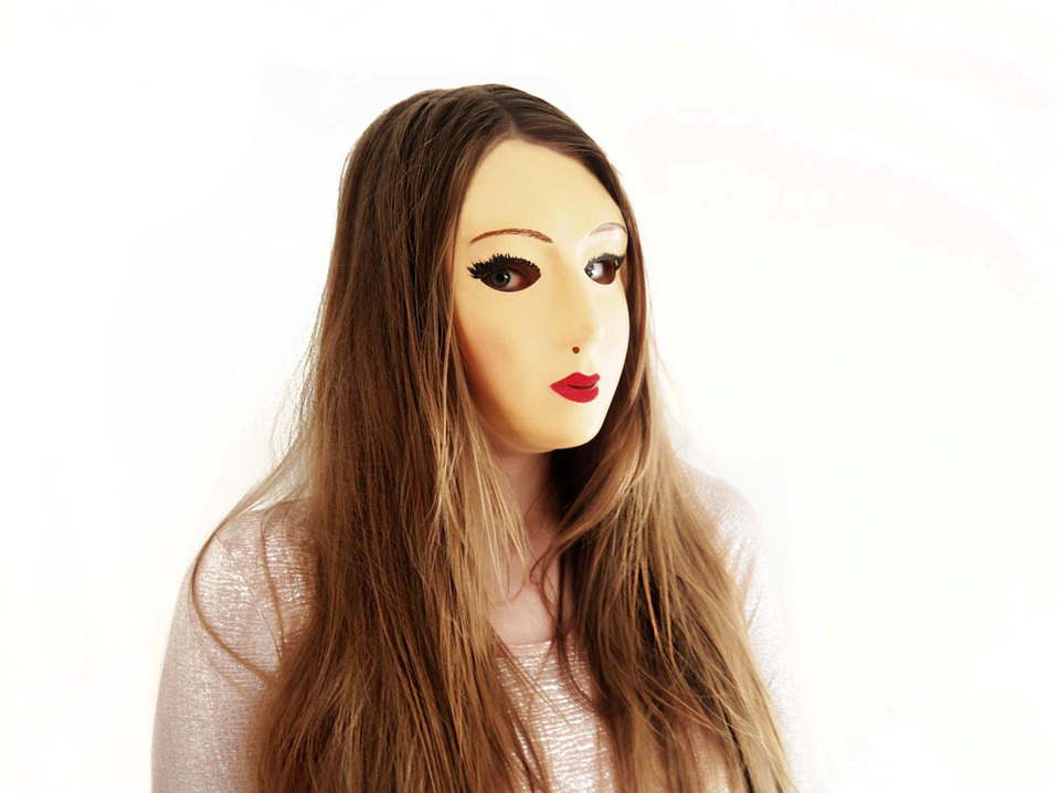
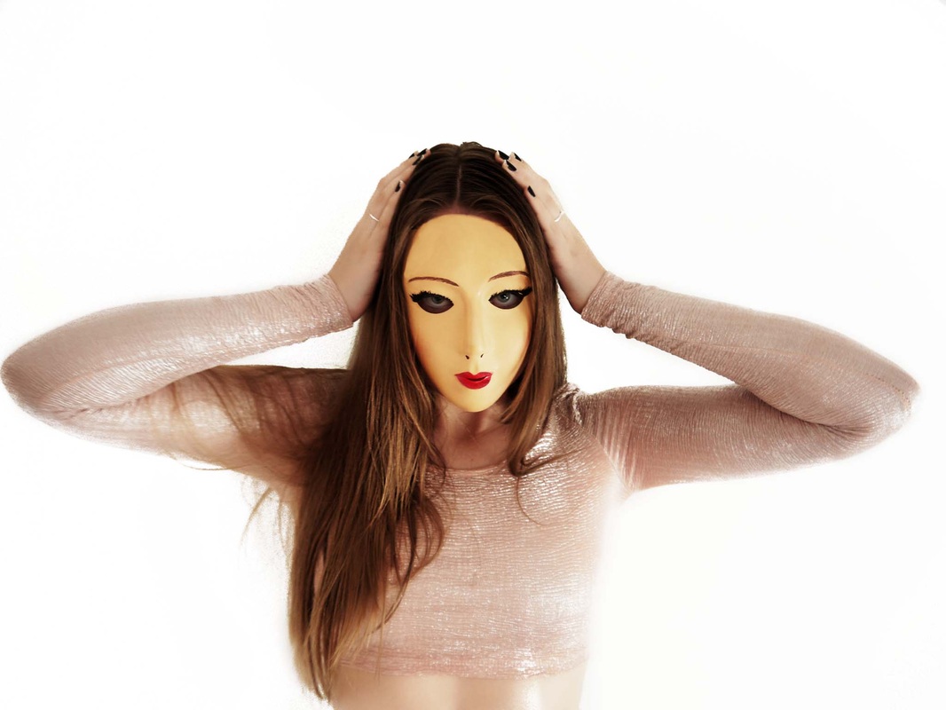
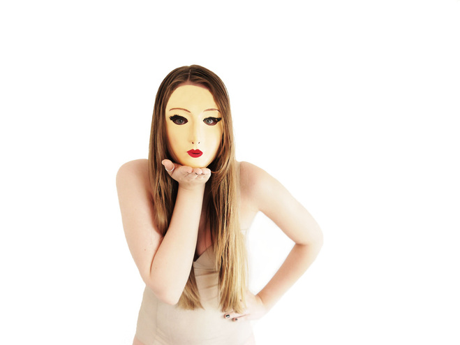
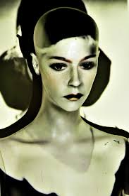
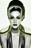
Natural vs synthetic: 'The mask'
I used a mask for this next set of photographs to give the efffect of a doll. The mask takes away the natural shape of the model and leaves her completely unrecognisable . I used photoshop to even out the mask and make it look like the model actual face.
|
|
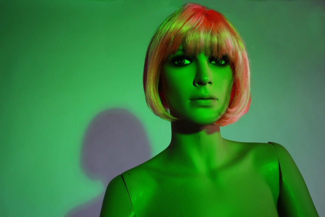
Stacey
I wanted to take pictures of a mannequin and to add to the overtly synthetic decided to use gels over the lights to create light washes of pinks and greens. I then adjusted the saturation on photoshop and burned in the dark areas to create a clear contrast. I liked this set of pictures as I think the mannequin looks very realistic.
|
|
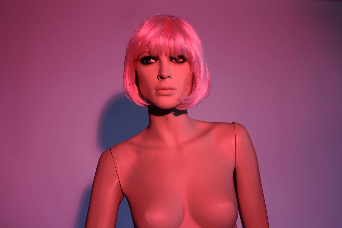
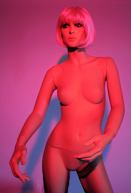
Juliette and Stacey
I wanted to develop my Set of photographs of my mannequin and decided that it might look effective if I used a model who was also dressed with bright colours and highly synthetic materials. I then used photoshop to create more of a glow around both of my subjects. I also created glossy look using the surface area blur on the skin and the sharpening tool on the hair. and the shiny top of the girl to highlight the details and other colours. After trying out different lights I settled on a a fresnel spotlight to light both subjects from the front. It worked perfectly at illuminating the subjects. The lack of lighting on the backdrop combined with the brightness of the Fresnel spotlight did cause shadows on the back screen but this was easily removed on photoshop using the burn tool at a high exposure. I think this set of photographs worked really well and I chose these two in particular as I like the vacant, lifeless stare of the model, making both human and mannequin hard to tell apart.
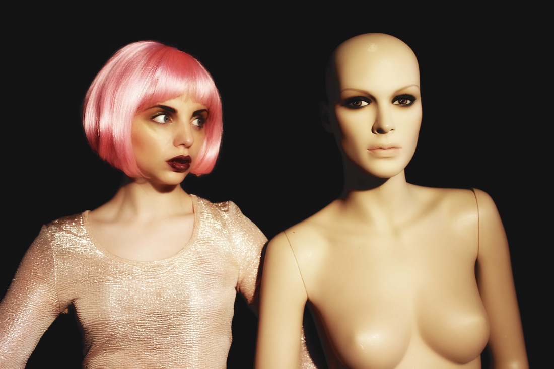
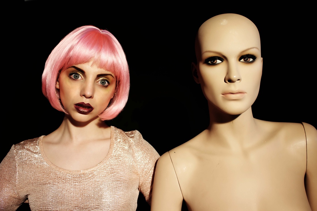
How I edited these photographs- I did a screen recording of my process of editing. I applied the same adjustments and touch ups to every image. Focusing mainly on the face of the real life model and the colour correcting of the photograph as whole.
|
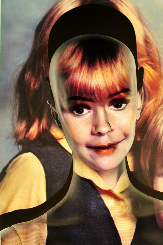
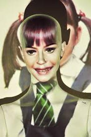
Moira SpruntMoira Sprunt is an english photographer who i came across when researching for inspiration. She took this set of photographs which include school photographs which when projected onto the mannequin give an ageless face. Whist behind is the very apparent appearance of a young child. I think these set of photographs are very interesting.
|
|
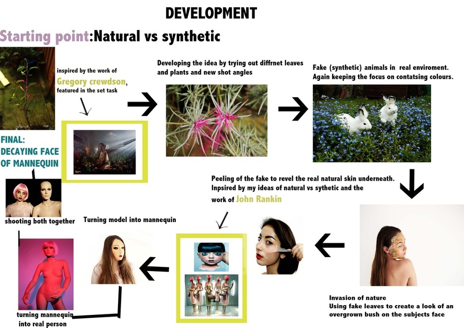
FINAL PIECE
For my final piece I decided to make a stop motion film to be projected onto the face of my mannequin, Taking inspiration from the work of Moira Sprunt. I wanted to combine this idea with the peeling of the face set of photographs I had taken earlier on. I wanted to used photoshop to Create the look of old, mankey skin underneath. As I didn't like the technique I used earlier on I decided to experiment with HDR toning to create the old skin. I found this worked very well especially when I used the 'increase detail' tool. I used the HDR layer underneath and rubbed away from the top smooth layer where needed. I spent a lot of time trying out different pictures and projecting them onto my mannequin to see which would look the most effective. i found that the ones where the model is straight on worked best. with small moments such as blinking or smiling working well do include as burst frames in my stop motion. Overall I was very happy with my final product and like that by using to different models there is a clear change in identity leave the mannequin still faceless. If i had more time I would want to experiment with more projections of decay and false identify on the parts of the mannequin such as the stomach.
